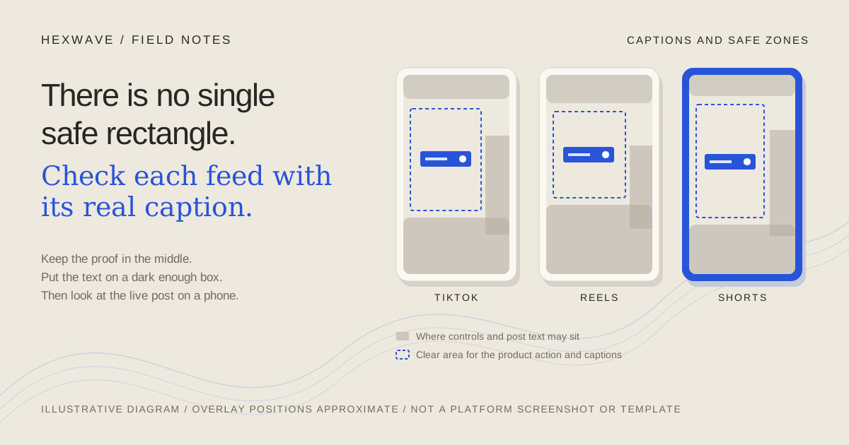
Picture a fictional invoicing app. The demo's whole point is one moment: you mark an invoice as paid, and a green "Paid" badge appears at the right end of the row while a "Payment recorded" notice slides up in the bottom-right corner. On the editing timeline it looks fine. In the feed, the like and share buttons sit on top of the badge and the account name and caption cover the notice. The video still plays. It just no longer shows the thing it was made to show.
The short answer: keep the product action and any text you need read out of the screen edges, especially the bottom and right side, and then check the actual post in each app. Don't trust a single "universal safe zone" template. The interface over your video changes with the platform, the length of your caption, the device's screen shape and whether the post is an ad. The platforms publish less official geometry than the internet's templates suggest, and most of what they do publish is for ads.
This guide covers placement, contrast, caption timing, the choice between burned-in and native captions, and the checks to run on an export. Platform guidance was checked on 14 October 2026. For recording the demo itself, see the short-form product demo guide.
Why the clear area keeps moving
Three kinds of interface sit over a vertical video in TikTok, Reels and Shorts: a column of actions on the right (like, comment, share and so on), a block at the bottom (account name, the post's text, audio or links), and controls along the top. All three can change size.
The platforms say so themselves. TikTok's in-feed ad specs say the safe-zone size "is determined by the dimension (vertical, horizontal, or square), ad caption length and any additional formats used," and that the ad preview "is not specific to a device." Meta's Reels ad guidance gives the reason for its margins as avoiding crops, the profile icon and call-to-action, and screens taller than 9:16. Google Ads says overlays and buttons on its vertical placements "may appear in different places depending on the format, campaign type, and screen."
So a rectangle drawn from one screenshot of one phone describes that phone, that app version and that caption. A three-word caption leaves more of your frame visible than a three-line one. A tall phone shows the 9:16 video differently from a shorter one. That's one likely reason third-party safe-zone templates disagree with each other: they're measuring different situations. It doesn't make them useless as a rough guide. It does mean none of them is the official number.
There's also a layer you don't place at all. If a viewer turns on the platform's own captions, that text appears over your video too.
What each platform actually publishes
Here is what we found in official documentation. "Not published" means we didn't find an official figure; it doesn't mean the interface has no overlay.
| Platform | Official geometry we found | What it covers | What it doesn't tell you |
|---|---|---|---|
| TikTok | Downloadable safe-zone files in the in-feed ad specs (page last updated June 2026). The page text states no margins; the layout is in the files. Separate files exist for ads using anchors and for right-to-left regions. | Auction in-feed ads | An official figure for organic posts. We found none. |
| Instagram Reels | Meta's Reels ad specs: leave at least 14% at the top, 35% at the bottom and 6% on each side free of text, logos and key elements. Recommended asset: 9:16, 1440 × 2560. | Reels ads | An official figure for organic reels. We found none. |
| YouTube Shorts | A 1080 × 1920 vertical safe-area template (transparent PNG) in Google's video ad specs. For organic Shorts, the in-app editor shows visual guides where the like button, comments and description might appear. | Vertical ads; text and stickers added in the Shorts editor | A published pixel figure for organic Shorts, or any warning about text burned into your file before upload. |
Meta's percentages are the only official numbers stated as plain text, so they're the easiest to set up as guides in an editor. On a 1080 × 1920 frame they work out to about 269 px at the top, 672 px at the bottom and 65 px on each side, leaving a clear area roughly 950 px wide and 979 px tall. That's our arithmetic from Meta's percentages, not a figure Meta publishes, and it describes Reels ads. Use it as a cautious starting guide on all three platforms if you like, then check each one. Don't call it TikTok's or YouTube's safe zone.
The YouTube editor guides have a gap worth knowing about. They react to text and stickers you add in the Shorts editor. A caption already burned into your exported file is just pixels to that editor, so it won't warn you when that caption sits under the like button.
Frame the demo so the proof lands in the middle
Placement starts before the edit. Back in the invoicing example, the problem isn't really the caption. The badge and the notice appear in the bottom-right corner of the app, which is the corner a vertical feed covers most.
You have three options, roughly in order of preference:
- Change where the action happens on screen. Record with a narrower browser window, or scroll so the invoice row sits in the middle of the frame. The product behaves the same; you've only moved the evidence.
- Reframe in the edit. Crop or pan to the row while the badge appears. This works if the crop keeps the row's text legible on a phone. Recording closer is usually better than enlarging a wide capture.
- Restate the result. If the notice must appear in a corner, add a short on-screen label in the clear area ("Marked paid") at the same moment. The label repeats the proof; it doesn't replace it, and it shouldn't claim anything the screen doesn't show.
Then place captions above the bottom block rather than at the very bottom of the frame. Keep them out of the top strip as well. With Meta's guide set up, the captions and the "Paid" badge both need to sit inside the roughly 950 × 979 px middle area. If they compete for the same spot, move the caption, not the proof.
For a physical product the logic is the same. The hand closing the lid or the strap clicking into place is the evidence. Keep that action away from the right column and the bottom block when you frame the shot.
Make the text readable over whatever is behind it
Product demos have a specific contrast problem: software is often white. White caption text over a white app screen has a contrast ratio of 1:1, which means it is invisible except for any outline. Over a light gray panel (#F3F4F6) it's about 1.1:1.
WCAG's contrast criterion asks for at least 4.5:1 for normal text and 3:1 for large text (18 point, or 14 point bold), measured against the background the text is actually rendered over. It's a web-accessibility standard, not a platform rule, but it gives you a concrete target instead of "make it pop."
A semi-opaque box behind the caption is the dependable fix when the background keeps changing. We worked through two versions of white text on a black box over a white app screen:
- A 60% black box blends to roughly #666666 over white. White text on that is about 5.7:1, which clears 4.5:1.
- A 40% black box blends to roughly #999999. White text on that is about 2.9:1, which fails even the large-text target.
Those ratios are our calculations using the WCAG formula for the colors given; check your own colors with any WCAG contrast checker. A dark outline or shadow can also work, but its thickness and softness change the result, so judge it on the brightest frame.
That last point matters for video. Check contrast where the background is worst, not where it's average. In a demo, that's often the moment a white modal or settings page opens under the caption.
Time captions to speech, and to the action
The FCC's caption quality standards were written for US television, not social video, but they're a sensible model. Captions should match the words spoken, appear with the words they represent, cover the whole program and not block important visual content. Any of those four can fail in a 20-second demo.
Two practical checks:
- Read along at normal speed. Watch the export without pausing and read each caption aloud. If you can't finish a caption before it disappears, split it or shorten the wording. For a text-led post with no narration, the reader has nothing else to go on, so give text longer than feels necessary when you're the one who wrote it.
- Don't ask the viewer to read and watch at once. If a new caption appears at the exact moment the badge appears, the viewer has to choose between them. Let the caption that sets up the action finish just before the action, or keep the caption short during it.
Word-by-word animated captions are a style choice. They can be lively, but each new position on screen is another chance to cover the product. If you use them, check that the animation stays inside the clear area for the whole post, not just the first few seconds.
Burned-in or native captions
Burned-in captions (W3C calls them open captions) are part of the video image. Native captions are generated or uploaded in the platform and can be turned on or off by the viewer.
| Burned into the video | Native platform captions | |
|---|---|---|
| Who controls placement | You. The platform can't move them out of the way. | The app. You don't choose where they appear. |
| Can viewers turn them off | No | Yes; viewer control is what makes them closed captions |
| Travel to every destination | Yes, the same pixels go everywhere | No, they're set up separately on each platform |
| Fixing a mistake | Re-export and re-upload | Edit the text in the platform, where it allows |
| Main risk | A typo or a bad position is permanent for that post | Automatic transcription gets product names wrong |
On the native side: TikTok's announcement of auto captions describes creators turning them on in the editing page and editing the text, and viewers turning captions off. YouTube says that when automatic captions are available they're published automatically on long-form videos and Shorts, that they can misrepresent speech, and that you should review and edit them. Instagram has a help article on managing closed captions for reels; we couldn't load its full text when checking, so check the current steps in the app.
My recommendation for a narrated product demo: choose one caption track per post. If you burn captions in, you're relying on your own placement and spelling everywhere; that's easiest when the post is designed to work with the sound off. If you rely on native captions, review them on each platform, because an invoicing app's name can come back as an ordinary word. Burning captions in and also leaving automatic captions available can show the viewer two versions of the same sentence if they turn captions on. You can avoid that on platforms where you control the native track, but check rather than assume.
Short labels that name what's on screen ("Marked paid") are different from captions of speech. Those can be burned in alongside native captions, as long as they sit in a different part of the clear area.
Check the export, then check the post
The timeline in your editor is not what the viewer sees. Run these on the exported file and then on the uploaded post:
- Watch the exported file on a phone, full screen, at normal speed. Not the editor preview.
- Lay a guide over it. Use TikTok's downloadable files if you're preparing a TikTok ad, Meta's percentages for Reels, Google's template for Shorts ads, or the Shorts editor's guides for text added there. For organic posts, treat any of these as a starting reference, not a guarantee.
- Pause on three frames: the first frame, the moment the product does its thing and the result. Each should show what it's supposed to show with the guide on top.
- Find the worst background for each caption and check its contrast there.
- Read every caption against the approved script, with special attention to product names, prices and numbers. A caption that changes a claim is a content change, and it needs the same review as the script. The review guide covers that check.
- Preview in each app with the real post text. Paste the caption you'll publish, not a placeholder, since caption length changes what's covered.
- After publishing, view the live post on a phone and, if you can, on a phone with a different screen shape. If something important ended up under the interface, fix the export rather than hoping the next app update moves the buttons.
The other per-destination decisions, such as covers, audio and links, belong to a separate checklist; the cross-platform publishing guide covers them.
Back to the invoice
The fixed version of the fictional demo doesn't need a clever template. The invoice row sits in the middle of the frame when it's marked paid. The caption sits above the bottom block, on a box dark enough to read over the white app. It finishes before the badge appears, and nothing covers the badge on TikTok, Reels or Shorts when the post is viewed with its real caption.
Take your own demo and find the one frame that proves the claim. If you can see that frame clearly in the live post on each platform, the caption has done its job. If you can't, move the proof before you polish anything else.
Hexwave's format library shows the kinds of product formats we're building toward. The placement and contrast checks above work in whichever editor you use today.
Sources & reference material
- TikTok Auction In-Feed Ads — TikTok Ads Manager Help, checked October 14, 2026. Page marked 'Last updated: June 2026'. States that safe-zone size depends on dimension, ad caption length and additional formats; offers downloadable safe-zone files; says the ad preview is not device-specific. Applies to ads. The pixel layout is inside the downloadable files, which we did not transcribe; the page text gives no margin numbers and says nothing about organic posts.
- Awareness Video Ad Specs on Instagram Reels — Meta Ads Guide, checked October 14, 2026. Recommends leaving at least 14% of the top, 35% of the bottom and 6% of each side free of text, logos and key creative elements; 9:16 at 1440 x 2560. Ads guidance only; no date shown on the page. Pixel conversions in the article are our arithmetic, not Meta's figures.
- About video ad specs — Google Ads Help, checked October 14, 2026. Provides a 1080 x 1920 vertical safe-area template as a transparent PNG and says overlays and buttons vary by format, campaign type and screen. Ads guidance; its measurements are in the template image, which we did not transcribe.
- Enhance your Shorts — YouTube Help, checked October 14, 2026. Describes visual guides in the Shorts editor that show where the like button, comments and description might appear, plus white lines near edges where content may be hidden on some devices. Applies to text and stickers added in that editor; gives no pixel figure.
- Use automatic captioning — YouTube Help, checked October 14, 2026. Covers automatic captions on long-form videos and Shorts, says available automatic captions are published automatically, may misrepresent speech, and should be reviewed and edited.
- Introducing auto captions — TikTok Newsroom, checked October 14, 2026. Feature announcement: creators select auto captions in the editing page and can edit the text; viewers can turn captions off. Undated on the page and older than current app screens; it does not establish current menu paths or language coverage.
- Manage closed captions for your reels on Instagram — Instagram Help Center, checked October 14, 2026. Official help article on reel closed captions. Its body did not load in our checks (error/CAPTCHA), so the article relies on it only for the existence of the feature, not for steps or placement.
- Understanding Success Criterion 1.4.3: Contrast (Minimum) — W3C Web Accessibility Initiative, checked October 14, 2026. Defines 4.5:1 for normal text and 3:1 for large text (18pt, or 14pt bold), measured against the background the text is rendered over. A web-content standard used here as a benchmark; it is not a TikTok, Instagram or YouTube requirement.
- Captions/Subtitles — W3C Web Accessibility Initiative, checked October 14, 2026. Updated 17 September 2024. Distinguishes closed captions (viewer can turn on/off) from open captions (always displayed). Does not give placement rules or reading-speed numbers.
- Closed Captioning on Television — Federal Communications Commission, checked October 14, 2026. Caption quality standards for US television: accuracy, synchronicity, completeness and placement that does not block important visual content. Applies to TV programming, not social video; used as a quality model only.